Internet Explorer Mobile – QVGA web site do not scale well to VGA screen
As described in this post, I was looking for a way to get a proper view of pages designed for QVGA screens on devices with higher resolutions like VGA.
The trick is to use the non-standard viewport META tag. As described here, here and here, you can use meta-viewport to define the initial viewport, the part of the page you want to see and a zoom level.
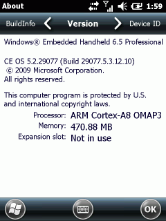
Fortunately the meta tag for viewport works within Internet Explorer Mobile (Windows Embedded Handheld 6.5.3).
The differences between the html code of image 1) and image 2) is just one additional line in the head section of the code for image 2):
<meta name="viewport" content="width=240, initial-scale=2, maximum-scale=2, minimum-scale=2">
This line makes the viewport equal to the PocketPC QVGA width of 240 pixel and specifies a zoom level of 2 to enlarge the viewport onto the VGA screen with a width of 480.
Now, my final goal is to disable the Zoom bar of Internet Explorer Mobile.
See also this post about QVGA and VGA scaling.


 http://www.led-mg.de